
GNE Website Ecommerce Evoluion
I helped shape and evolve GNE’s digital experience through UX/UI design, front-end development, brand consistency, and ecommerce improvements. Working alongside developers, designers, leadership, and internal stakeholders, I helped turn business and customer needs into practical, intuitive digital experiences.
Platform Evolution & Strategy
When I joined Great Northern Equipment in 2017, the company’s web presence included a public-facing informational website and a separate dealer portal where B2B customers could access product information and place orders.
As GNE continued to expand its digital presence, I redesigned and rebuilt the public-facing website using Wix, creating a more modern brand experience while the established dealer ordering portal continued to support ecommerce.
Several years later, GNE began the next stage of its digital evolution, bringing the public website and dealer portal together into a single integrated ecommerce experience built on NopCommerce. As Digital Design Manager, I contributed to the platform’s UX/UI, front-end development, visual system, content architecture, ecommerce experiences, and ongoing enhancements while collaborating with the Ecommerce Director, developers, designers, product teams, and other stakeholders.
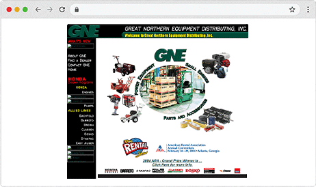
Legacy Website
Public-facing informational website in place when I joined GNE.
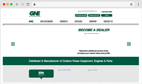
Wix Website Redesign
Redesigned and rebuilt public-facing website.
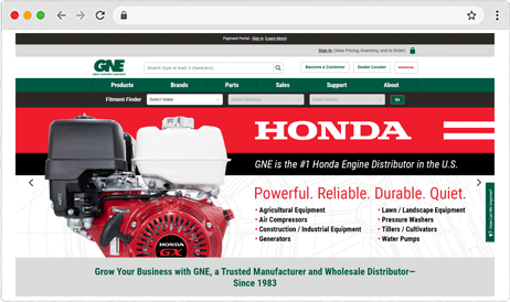
Integrated Ecommerce Platform
Unified NopCommerce website and B2B dealer experience.
Design System and Brand Consistency
As the ecommerce platform grew, I helped establish and maintain consistent visual and interface standards across the GNE website. This included typography, color, buttons, iconography, navigation elements, content components, and other reusable UI patterns that helped create a cohesive experience across the site.
Typography
Body Copy
Great Northern Equipment connects dealers with equipment, parts, and accessories from trusted brands. Clear product information and consistent content help customers quickly find the resources they need.
Editorial StyleHeading capitalization followed Chicago-style title case conventions to maintain consistency across page titles, section headings, promotional content, and other customer-facing copy. Online capitalization tools were used as a quick reference when reviewing content.
Color
#005941
#2D2A26
#595959
#D9DAD9
#EFEFEF
Color Usage
GNE Green served as the primary brand color throughout the digital experience, supported by a neutral palette for typography, backgrounds, borders, and interface elements. Consistent color usage helped reinforce the GNE identity while maintaining clear visual hierarchy across the ecommerce platform.
Accessibility & ContrastColor combinations were selected with readability and contrast in mind, particularly for navigation, buttons, links, and other interactive elements.
Buttons
Action Hierarchy
Primary, secondary, and tertiary button styles were established to create a clear hierarchy of actions throughout the site. Primary buttons emphasized the most important next step, while secondary and tertiary styles supported alternative actions without competing for attention. Consistent button treatments helped users quickly understand available choices and navigate the ecommerce experience with greater confidence.
Interaction StatesButton states were designed to provide clear visual feedback and distinguish available actions from those that were temporarily unavailable.
Iconography
 Cart
 Confirmation
 Customers
 Manufacturing
 Products
 SKU
Consistent Visual Language
Font Awesome icons were used throughout the GNE website to create a consistent visual language across navigation, ecommerce features, resources, and supporting content. Solid icons with clean, defined edges were selected whenever possible to maintain a cohesive style and make common actions easier to recognize throughout the experience.
UI Components
Snackbars & System FeedbackConsistent snackbar treatments provided clear visual feedback for system messages, confirmations, and errors. Color, iconography, and messaging worked together to help users quickly identify the type and importance of each notification.
Success Message

Information Message

Error Message